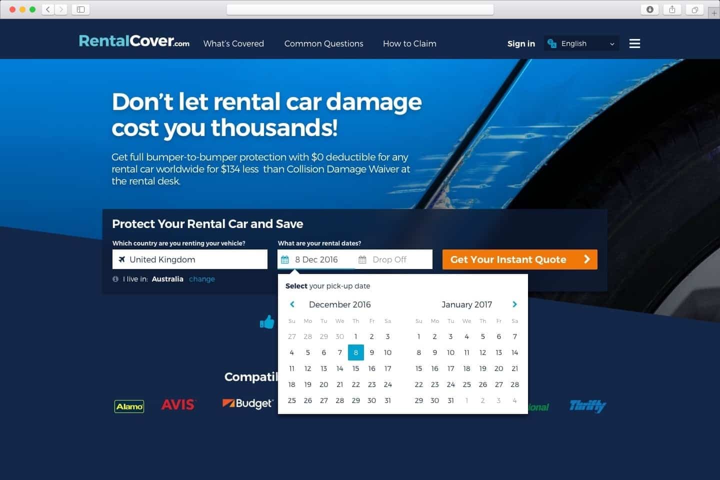
Bumper to bumper redesign
Redesigning and conversion optimisation for multi-lingual insurance provider RentalCover.com.
Brand: RentalCover
Role: Creative Direction / UX
Challenge
The tech team had built a solid micro services API with some impressive data & analytics reporting. Using this rich set of information & stats we focused on redesigning the frontend solution to reduce friction, create clear communication of the value proposition and increase trust in the service for the end users.

UX Tools
Metrics & Analytics
Stakeholder Interviews
Heuristic Reviews
Competitive Reviews
Requirements Workshop
User Research
The first task was gathering data by setting up tracking of forms and customer journey mapping using HotJar & Formstack web apps which gave insights into both behaviour, feedback and journey mapping. This gave us a clear understanding of where there were critical drop off points within the purchase path.
 Reviewing Key drop off interaction points.
 Breaking down the functional components with the tech team
 Email Comms Flow
UX Tools
Wireframes
Graphical Design Comps
Prototyping
IA & Site Map
Process & Task Diagrams
Functional & Visual Design
Using Comparative reviews and an audit of the current site, we formulated a series of low-fi prototypes using Sketch and invision to test and gather feedback. Once the initial wireframes and broad interaction components were decided upon, I worked alongside the frontend engineer to break down the screens into components and we created a new style guide and component library in Sketch to speed up the development process.
Wireframes


Style Guide


UX Toolkit
Proof of concept development
Implementation oversight
Style Guide
Development
Using Sketch & Craft (Invision Web App) we were able to make quick hi-fidelity mockups of the final designs which were tested internally and gathered feedback from both Customer Service & Tech Teams.
Much of the interaction design came through continuous improvements, after the initial release. We continued to monitor and apply tests and experiments to optimise the payment flow. Introducing Uber Menus for country selection, changing form labels for clearer expectations to reduce friction for the end-user and make it as quick and easy to get what they need.


