Keep the brand promise
Designing a new online claims system for World Nomads Group.
Brand: WNG
Role: Creative Direction / UX
Challenge
Travel insurance is a service not a product. How a company responds when their customers are in a fix speaks volumes about the brand and its values.
Our aim in designing a new online claims system for WNG was to speed up claim handling efficiency, become more responsive in communicating with customers and most importantly, give customers the confidence that we’re here to help.
UX Tools
Metrics & Analytics
Usability Testing
Stakeholder & End User interviews
Heuristic Reviews
Competitive Reviews
Requirements Workshop
User Research
After an initial research using stakeholder interviews, speaking with claims officers about their processes & pain points and setting up online surveys for existing customers about their current experience, we discovered the following complex issues and insights into where we could focus our attention:
Customer feedback:
- Spoke of a lack of timelines in communication around expectations and process which lead to dissatisfaction and frustration
- Voiced a lack of empathy around the process and customers felt the responses were robotic
- Found the paper forms were complex and confusing
Claims officers feedback:
- Had processing bottlenecks where information from customers was sent via mail and handwriting difficult to read
- Claims covers many different scenarios, it was difficult to keep track of different requirements for each product and brand
- Dealing with the gamut from simple to really complex claims
- In some situations, forms aren’t appropriate and a human voice is needed
We also held approx. 12 customer interviews where we asked the customer to take us through their entire journey from trip research, booking, travelling, and claiming. One of the key insights was the way customers referred to the moment that caused them to claim as an event. e.g. ‘Then I became sick’ or ‘That’s when I lost my bag’. This moment changed our approach and we realised that we needed to structure the entire claims process around the events that lead the customer to make a claim.


UX Tools
Wireframes
Graphical Design Comps
Detailed Spec
Prototyping
Usability Testing
IA & Site Map
Process & Task Diagrams
Functional Design
After gathering all the data, we began to synthesise these finding into initial experiments to test some ideas of how an online claims system might work.
Our initial experiment was building an event based question set prototype using formstack. At each step we held multiple user testing sessions which we recorded using Silverback. We then evaluated all feedback and incorporated into the next iteration. In total there were three rounds of testing before we felt confident enough to move into final production.
 Mapping out the Claim Process with key stakeholders
 User testing question flow prototypes using FormStack
 User testing on staging site
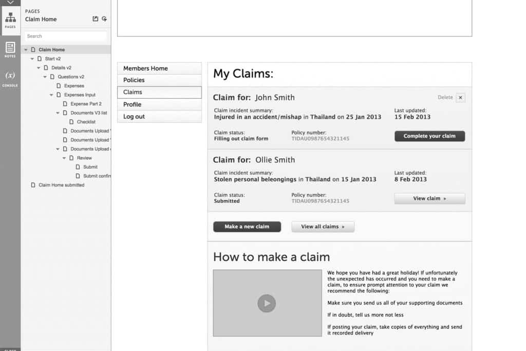
 Axure Prototype – Claims Home Page
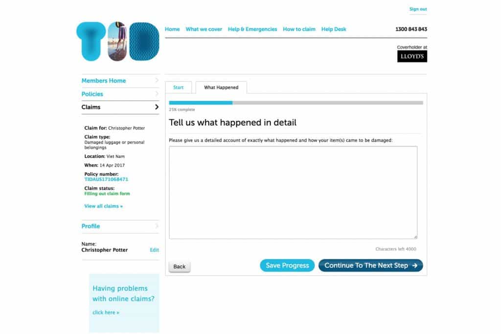
 Axure Prototype – Question Tab
Final Designs


Impact
- Users happy with an efficient and easy service
- Less calls for assistance with the new process
- More efficient processes for both customers & claims officers
- Digital doc upload
- Only ask for information relevant to claim
- Reduced claims handling times
- Reduction in disputes
- Created a complete rewrite of how we display both policy information before the customer purchases
- Formed a new plan to write a new events based PDS

